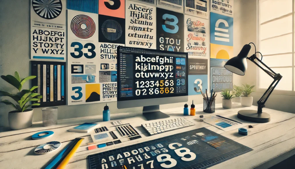
Typography is a crucial element of web design that significantly influences user experience, readability, and the overall aesthetic of a website. In 2025, the role of typography extends beyond mere text presentation to creating a seamless and engaging visual hierarchy that guides users through content. Here are the best practices to follow:

1. Prioritize Readability in Web Design
- Importance: Clear, legible text ensures users can easily consume content across different devices and screen sizes.
- Best Practice: Use fonts with clean, simple lines and sufficient contrast with the background. Sans-serif fonts are often preferred for their modern and minimalistic appeal.
2. Responsive Typography
- Importance: With varied devices and screen sizes, ensuring text adapts is essential for maintaining usability.
- Best Practice: Utilize relative units like em or rem for font sizes, enabling text to scale appropriately. Implement media queries to adjust typography for different screen widths.
3. Hierarchy and Structure
- Importance: A well-defined hierarchy helps users navigate content intuitively, highlighting the most important information first.
- Best Practice: Use varying font sizes, weights, and styles to establish a visual hierarchy. Headings should be larger and bolder than body text, with consistent spacing and alignment.
4. Custom Fonts and Branding
- Importance: Typography plays a significant role in branding, helping to convey a website’s personality and values.
- Best Practice: Incorporate custom or web-safe fonts that align with your brand identity. Ensure chosen fonts are supported across major browsers and have fallback options.
5. Performance Considerations in Web Design
- Importance: Fonts can impact page load times, affecting user experience and SEO rankings.
- Best Practice: Optimize font files by using modern formats like WOFF2 and limiting the number of font variants. Implement font-display: swap to prevent blank text during font loading.
6. Consistency Across Pages
- Importance: Consistent typography maintains a cohesive user experience and reinforces brand recognition.
- Best Practice: Define typograhttps://en.wikipedia.org/wiki/Typography#:~:text=The%20arrangement%20of%20type%20involves,symbols%20created%20by%20the%20process.phy rules in a style guide, covering font choices, sizes, line heights, and spacing. Apply these rules uniformly across all pages.
7. Accessibility and Inclusivity
- Importance: Inclusive design ensures content is accessible to users with visual impairments or reading difficulties.
- Best Practice: Choose fonts that are easily distinguishable and avoid overly decorative styles. Ensure adequate line spacing and avoid small font sizes. Use tools like screen reader testing to verify accessibility.
8. Whitespace and Legibility in Web Design
- Importance: Proper use of whitespace enhances readability and prevents visual clutter.
- Best Practice: Maintain generous line spacing (line-height) and padding around text blocks to improve legibility and focus. Avoid cramming text to maintain a clean, uncluttered look.
By following these best practices in 2025, web designers can create typographic systems that enhance the user experience, improve readability, and strengthen brand identity, all while ensuring the website remains functional and aesthetically pleasing.

